
Employer & Broker Portal
Overview
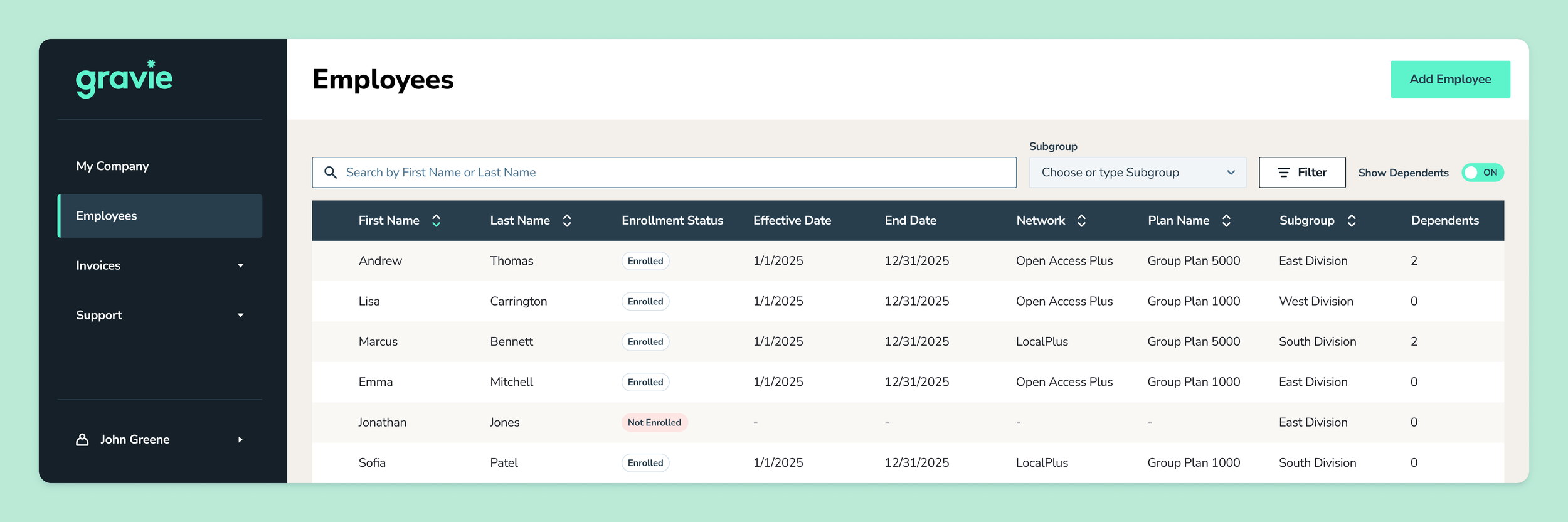
Gravie’s employer portal didn’t surface how its customers were structured or support how they onboarded people, so account managers were doing work the software should have handled. I redesigned it into a self-service B2B platform for employers and brokers.
Company
Gravie, a health benefits company (B2B SaaS)
Timeline
December 2024 — December 2025
No subgroup or dependents shown.
Users
Employers, brokers who manage multiple employer accounts, and Gravie account managers
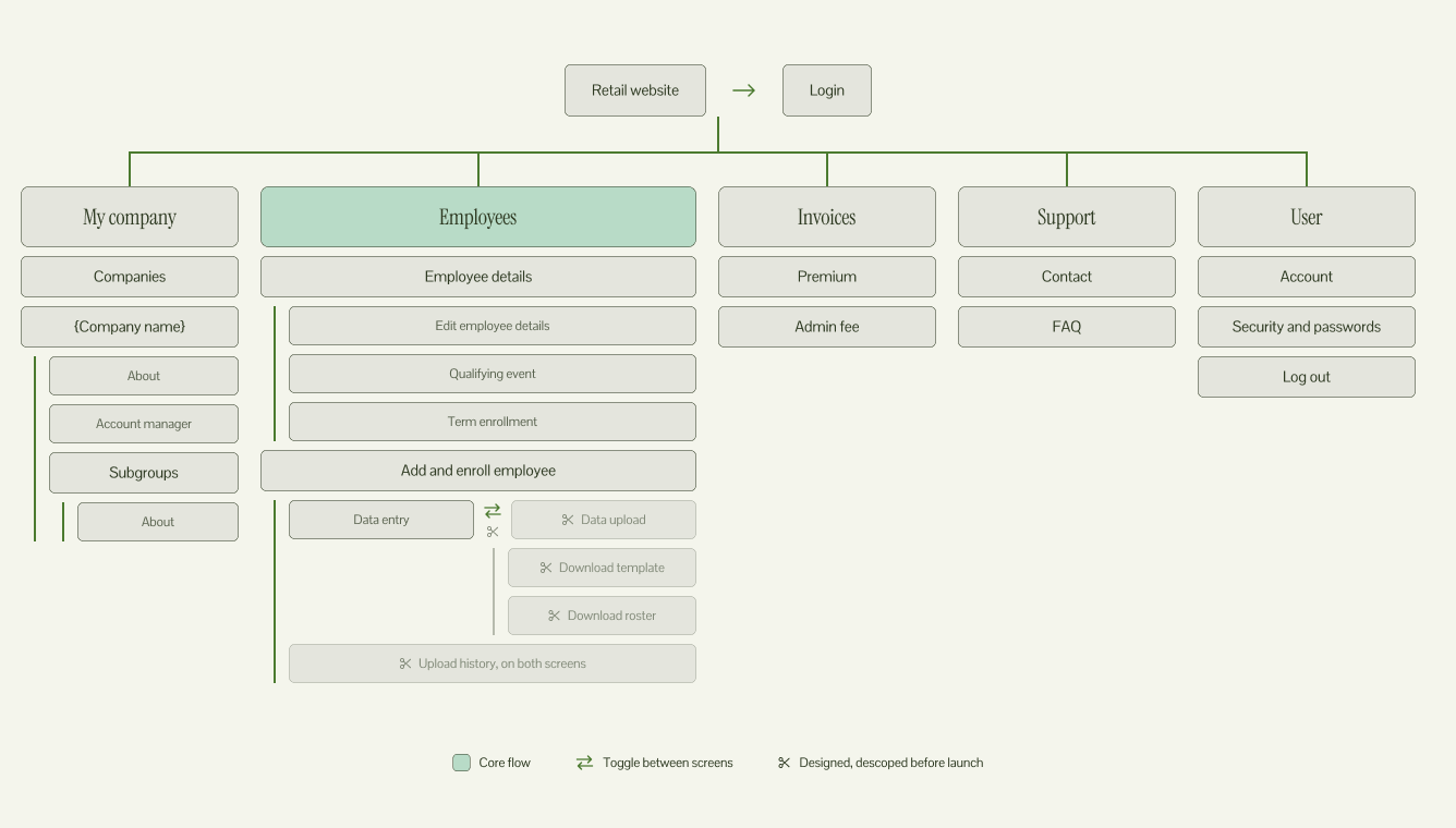
The structure after card sorting. Bulk upload was designed but descoped before launch.
What I designed
Account structure and subgroups, employee management, an adaptive onboarding flow, and self-service invoices
The Problem
The old portal only let employers add and terminate employees and view their coverage. Three gaps fell on account managers:
Key employee context was hidden. Parent and child employers existed, but the employee list and records didn’t show which subgroup someone belonged to or how many dependents they had.
One form for every situation. A single onboarding form served two products and several types of users, and fit none of them well.
No self-service billing. Account managers emailed invoices by hand.
Before
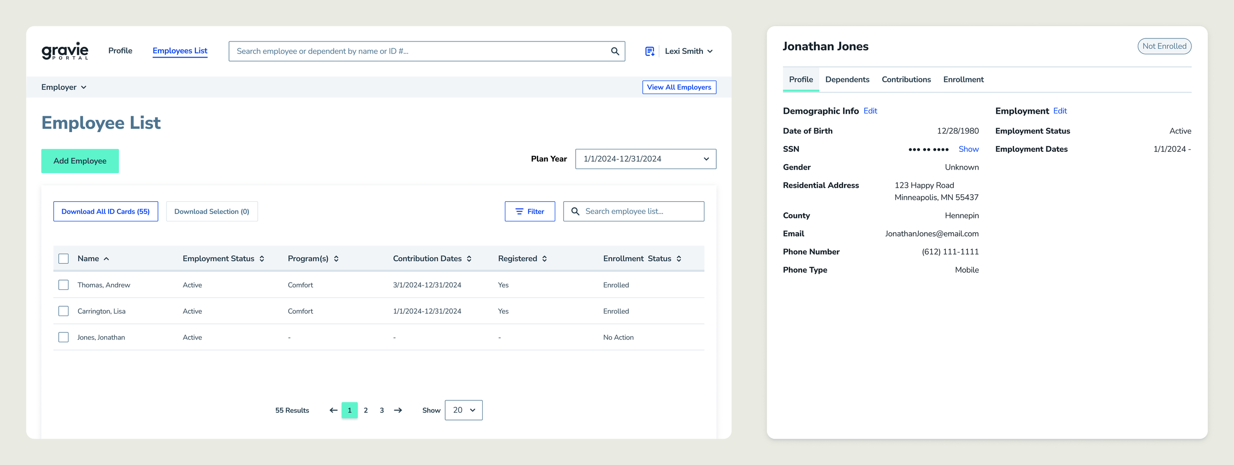
The list showed names and enrollment status, but no subgroup. Account managers had to ask which subgroup each employee belonged to.
The details page had no subgroup field, so the division was missing. Even after opening the employee, the subgroup information was not available.
My Role
I started as one of two designers. During development, the other designer rolled off and our PM left, so I owned design through launch, redlining specs, writing user stories, and working with QA to check builds. At the same time, I supported two development teams: web, with 9 engineers split between the member portal and this portal, and mobile, with 6 engineers.
To keep the portal moving, I documented every screen with an annotation panel covering questions, decisions, rationale, developer notes and tracking. I attended daily standups for both teams and gave quick feedback. Without a PM, I also had to make hard scope calls. With engineering limited by the product roadmap, I focused on getting the core functionality to employers and brokers, and the portal launched without bulk upload.
Research
Account managers saw these problems firsthand, so I started with them.
Interviews with three account managers surfaced the confusion over which subgroup employees belonged to.
Card sorting with several account managers showed how they connected items like qualifying events, enrollment summaries and ID cards. Their groupings shaped the new navigation.
Design reviews with an account manager tested decisions as I made them.
Account Structure
Some employers have one group, others have many subgroups, and brokers manage several employers at once. The structure had to work for all three without adding steps for any of them.
Employees get their own tab. Brokers usually come to the portal to manage employees, not employers. In a design review, an account manager and I agreed employees shouldn’t be buried under the employer list, so I gave them a direct tab.
How it works for each user:
Brokers select an employer, then can filter by subgroup.
Employers with subgroups go straight to Employees and filter if needed.
Employers with one group see their employee list, with no extra steps.
A subgroup column keeps division context on every row, which answers the confusion account managers raised about where each employee belonged. A Dependents column shows household size at a glance, and a Show Dependents toggle expands each row to list them.
Before and After
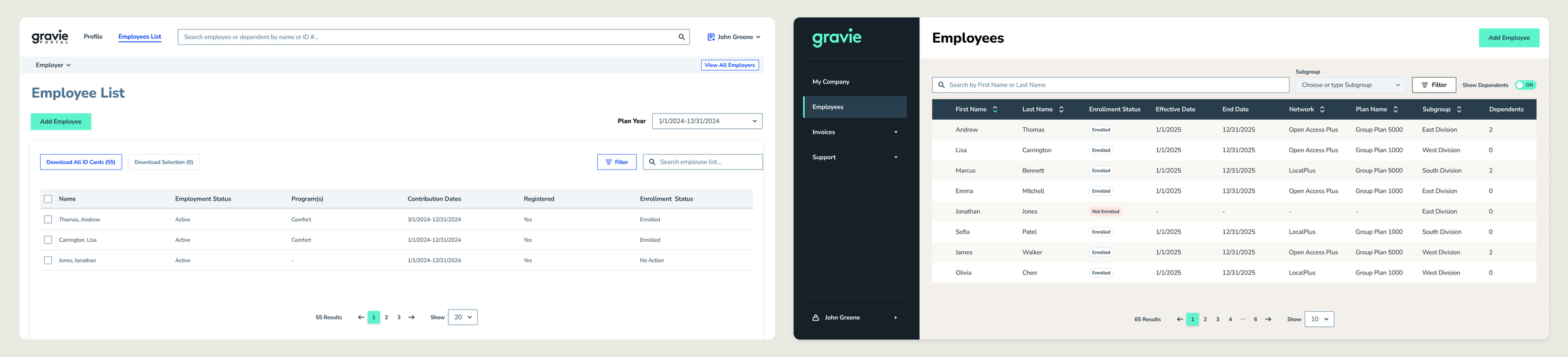
Subgroup and Dependents columns on every row, with filtering by subgroup.
Onboarding Employees
One form couldn’t serve every situation, so the Add and enroll screen adapts to whether an employer or broker is adding the employee, which product the employer uses, and how their account is set up. I also designed bulk upload, but it was descoped for engineering capacity, so the portal launched with single-employee entry.
Adding versus enrolling. Both tasks use the same details, so I designed one flow. Employers and brokers enter the employee’s information, then choose whether to enroll. A “Do not enroll” checkbox keeps the simpler task short.
Qualifying events. Selecting Qualifying event on Employee details adds fields where employers and brokers choose which event occurred.
Address changes. An address change could make an employee’s plan or network unavailable. The portal flagged it on save, so employers and brokers could pick another option or proceed with a cost warning while an account manager followed up. I chose a warning over a hard block to keep them in control.
Add and Enroll
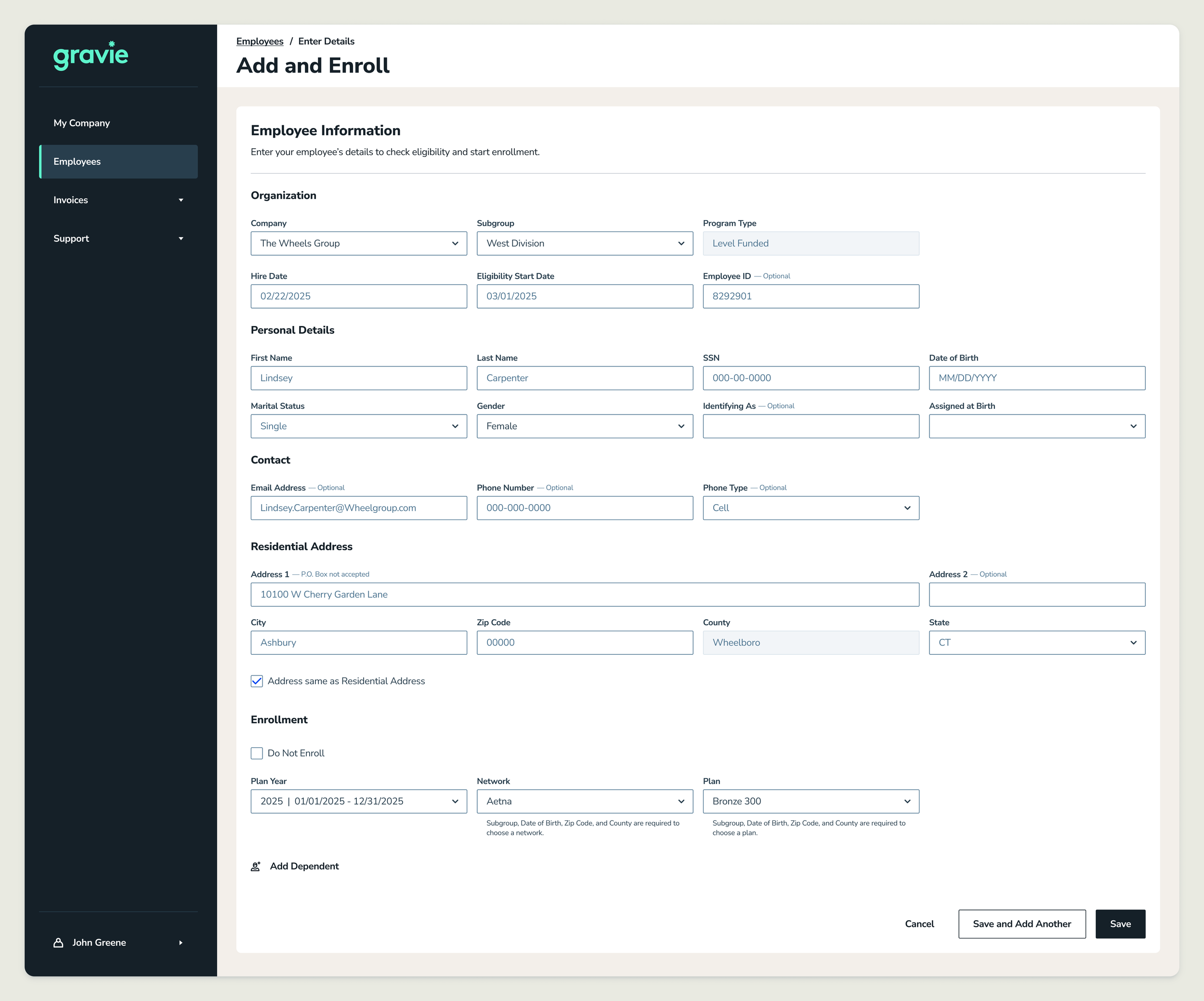
Employers and brokers enter an employee’s details, then enroll them or check “Do not enroll” to save without enrolling. Helper text shows which details are needed before a network and plan can be chosen.
Invoices
Account managers used to email invoices by hand. I designed an Invoices page where employers and brokers download them directly, filtering by invoice type (premium or admin fee), date range and plan year. I also designed the empty, loading and error states.
Results
Manual invoice emails ended: Employers and brokers could download invoices directly, so account managers no longer emailed them by hand.
2 products, 2 user types: Replaced one generic form with an adaptive add and enroll screen supporting ICHRA and Comfort for employers and brokers.
Visible account structure: Surfaced subgroups on every employee row and record, with filtering for organizations with different account structures.
3 core workflows in one portal: Account management, employee onboarding, and invoices, so employers and brokers could handle routine tasks without an account manager.
Reflection
Losing the PM and the other designer mid-project meant I took on scope calls, user stories, and QA. Clear documentation kept the team aligned as roles shifted. Descoping bulk upload was the right call for launch, and because it was fully designed, it’s ready to pick up later.
Account managers were my main window into the problem, and their knowledge shaped most early decisions. Next time, I’d build in time with employers and brokers directly, so workflows are tested with the people using them, not only those supporting them.
Success metrics weren’t set before launch, and the data to measure impact wasn’t tracked. The one outcome I could verify was the end of manual invoice emails. Going forward, I’d define baselines during discovery, such as onboarding time and error rates, so design decisions can be measured from the start.