
A Guided Shopping Flow for ICHRA Enrollment
Overview
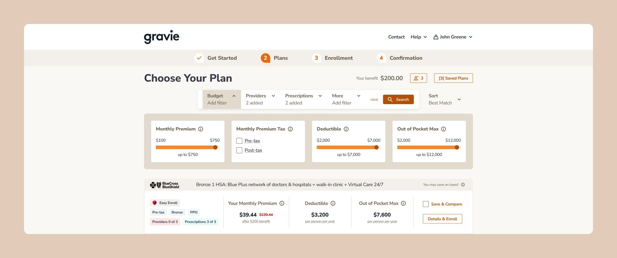
ICHRA was a new plan type at Gravie, and members had no way to enroll in it on their own. I helped design Gravie’s first digital ICHRA shopping and enrollment flow, focused on helping members find a plan that covered their providers and prescriptions.
Company
Gravie, a health benefits company
Address
Timeline
May 2024 — September 2024
Find Your Providers
Users
Members shopping for and enrolling in ICHRA plans
Tobacco Use
Answering this narrows the plans available.
What I designed
The Get Started flow, provider and prescription search, and the order of the shopping steps
The Problem
There was no digital enrollment experience for ICHRA. Enrollment ran through account managers and the carrier, which was time consuming, and members couldn’t see the full range of plans available to them, so they had no easy way to compare options. Most of all, members needed to know whether a plan covered their prescriptions and included their current providers.
My Role
I joined in May 2024, during brainstorming, and worked with two other designers and a PM through launch. I designed the Get Started entry point and the provider and prescription search, and worked with the PM on how members shop and the order of the steps.
Research
We used two methods to decide what members needed to see and in what order.
Usability testing with A/B variants. On UserTesting, participants aged 25 to 45 who had health insurance tried versions of the provider search. They didn’t want to search by doctor name alone. The version that worked best led with a Provider type dropdown, individual or organization, then matched names after three characters, then let members narrow by specialty.
Competitive analysis of onboarding flows from other healthcare companies, and of shopping experiences like airline booking that use similar card formats. These shaped three patterns on the plan cards: Save & Compare, a filter bar for budget, providers, prescriptions, and more, and chips showing how many of a member’s providers and prescriptions each plan covers.
Get Started
Before showing plans, the flow collects the details that determine which ones a member sees. We first led with tobacco use, since it narrows plans quickly, but it felt abrupt as an opening question. Confirming the member’s address first eased them in, so the order became address, tobacco use, then dependents.
Get Started Flow
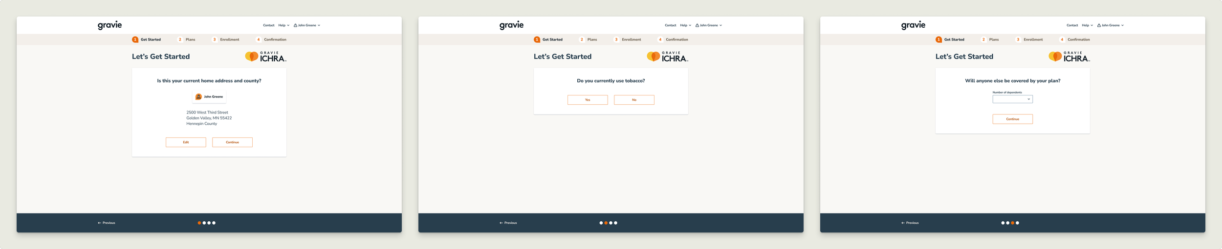
Members confirm the address on file, an easy first step before personal questions.
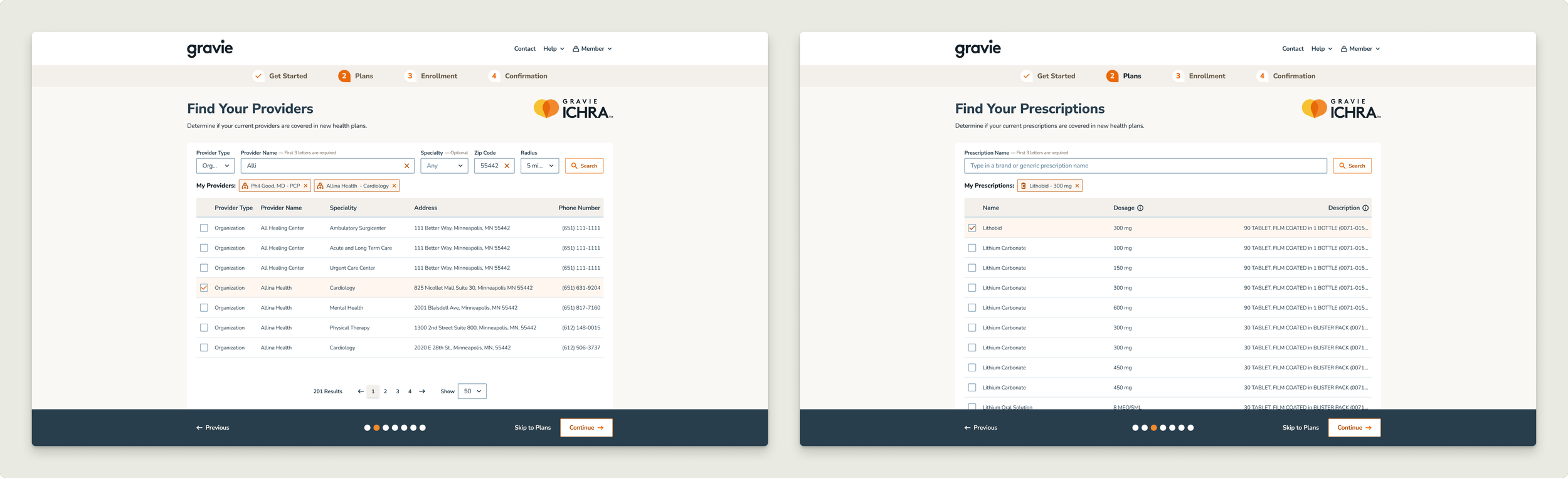
Members choose a provider type, then search by name, narrowing by specialty, zip code, and radius. Selected providers appear as chips they can review before moving on.
Dependents
Members say how many dependents need coverage.
Provider and Prescription Search
Provider search led with provider type, then name, then specialty, based on testing. The zip code defaulted to the member’s home address, the radius defaulted to 5 miles, and members could skip straight to plans. Selected providers appeared as removable chips with name and specialty, so members could review their list before moving on.
Prescription search organized results around the details members use to identify a medication: name and dosage, with a concise description for each, so members could confirm they’d found the right one.
Find Your Prescriptions
Members search by brand or generic name, and each result shows the dosage and a description so they can pick the right one. Selected prescriptions appear as chips.
Comparing Plans
Each plan card showed the premium after the member’s benefit, the deductible, the out-of-pocket max, and chips for plan type and coverage, such as Providers 0 of 3 or Prescriptions 3 of 3. Filters were optional, so members could skip them and go straight to the plan list. When no plans matched, the page said so and prompted members to adjust or clear their filters. We chose not to show the closest match automatically, so members wouldn’t assume it met their criteria.
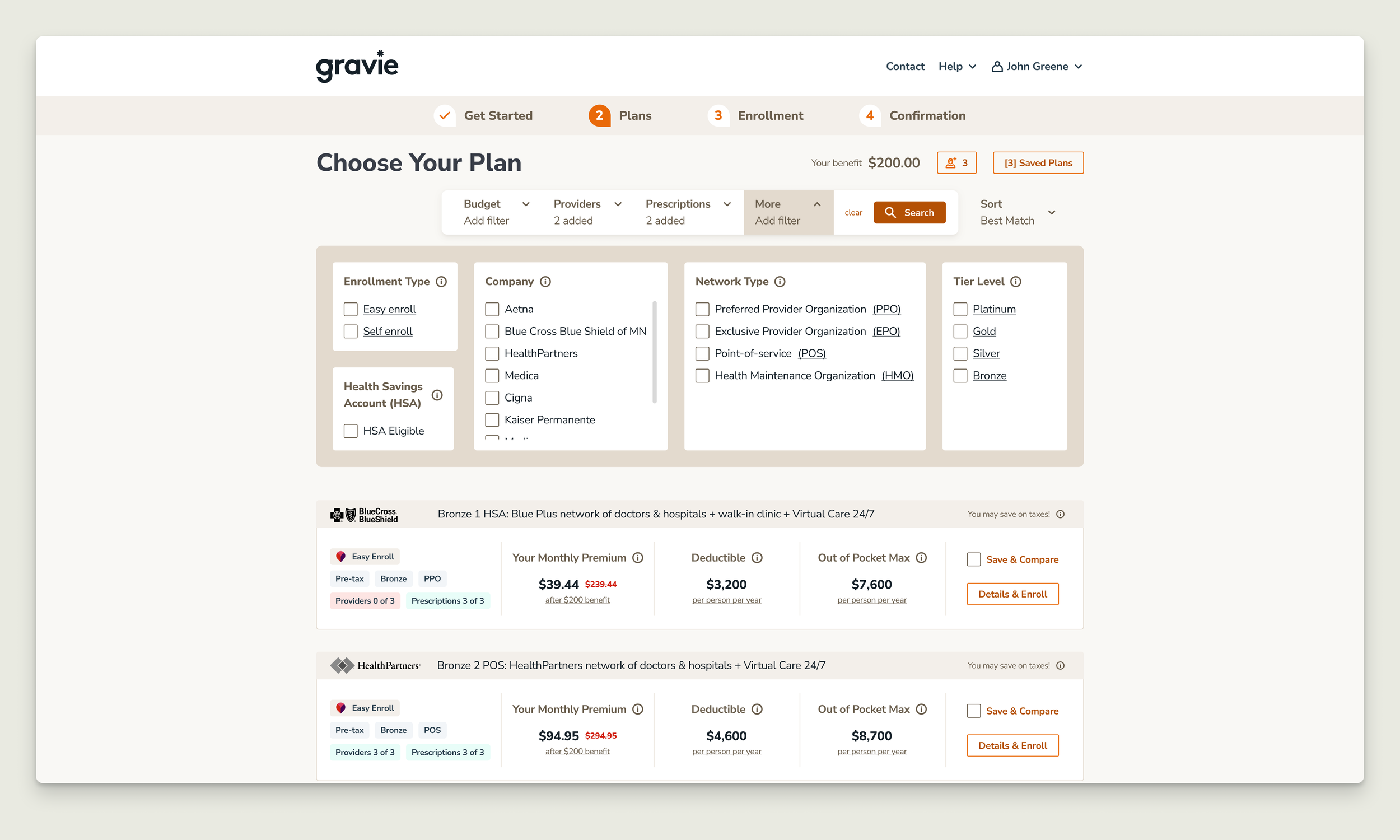
Members can narrow plans by budget, providers, prescriptions, and more, including company, network type, and tier, or skip the filters entirely. Chips on each card show how many of their providers and prescriptions the plan covers, and Save & Compare lets them weigh options side by side.
Continuing With a Coverage Gap
When comparing plans, members saw which of their providers were in network for each plan, and they could still enroll in a plan that missed some. A plan without a member’s providers might still be the best choice for their budget or prescriptions, so the goal was to make the tradeoff clear, not to make the decision for them.
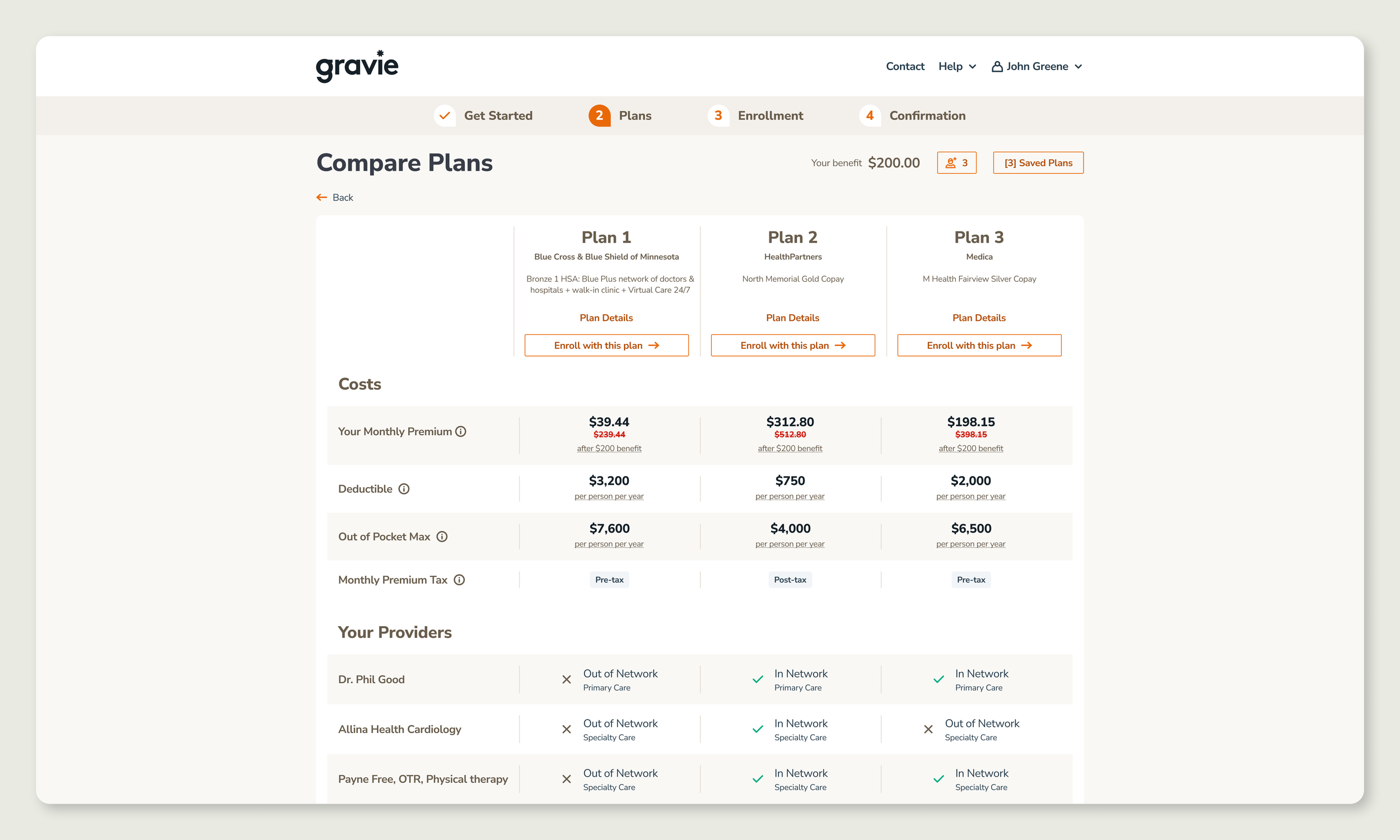
Plan 1 costs the least but covers none of the member’s providers. Plan 2 covers all three at a higher price. Members can enroll in either.
After Launch
Members reported trouble finding their providers and prescriptions. Both came from Talon, a partner whose search used fuzzy matching, so results were a broad mix instead of prioritizing what members typed. Over several calls, I worked with Talon to narrow results to exact matches, and the update shipped quickly so members could find their care without contacting our care team.
Results
First digital ICHRA enrollment: Members could shop for and enroll in ICHRA plans on their own, instead of going through account managers and the carrier.
Coverage visible before choosing: Plan cards showed how many of a member’s providers and prescriptions each plan covered.
More accurate search after launch: Worked with Talon to move provider and prescription search to exact matches.
Reflection
Joining at brainstorming let me shape the flow from the start, and testing showed that small choices, like leading with provider type or moving the tobacco question after address, changed how easily members moved through it.
The search issue only surfaced after launch, because testing used sample data rather than Talon’s real results. Next time, I’d test search against the partner’s live data before launch, so matching problems are caught before members see them.
Success metrics weren’t defined before launch. Going forward, I’d set baselines during discovery, such as enrollment completion rate and drop-off by step, so the impact of design decisions can be measured.